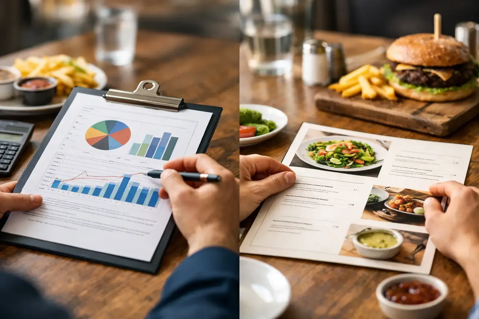
A menu can look polished, read clearly, and still lose money every shift. That is where menu engineering vs menu design gets misunderstood. One discipline tells you what deserves to stay, change, promote, or leave the menu. The other determines whether a guest can find it, understand it, and feel good ordering it.
Operators need both. But they need to use them in the right order. A redesigned menu cannot fix a poor-margin product mix, and a profitable menu strategy will not perform if the layout buries the items you need guests to notice.
What Menu Engineering Actually Does
Menu engineering is a financial and sales analysis process. It evaluates each item based on two primary measures: contribution margin and popularity. Contribution margin is the selling price less the direct cost of the food or beverage sold. Popularity is generally measured against sales mix, or how often an item sells relative to the rest of its category.
The goal is not simply to identify your highest-priced item or lowest food-cost percentage. A $14 appetizer with a 25% food cost may be less valuable than a $12 appetizer with a 32% food cost if the second item delivers more gross profit dollars and sells three times as often.
A basic menu engineering review usually sorts items into four categories:
| Category | What It Means | Operational Response | |---|---|---| | Stars | High contribution margin and high popularity | Protect quality, availability, and placement | | Plowhorses | Low contribution margin and high popularity | Improve margin without damaging demand | | Puzzles | High contribution margin and low popularity | Reposition, rename, train staff, or reconsider value | | Dogs | Low contribution margin and low popularity | Remove, rebuild, or retain only for a strategic reason |
That framework is useful, but it is not a final decision-maker. A low-selling entrée may support a brand promise. A labor-intensive cocktail may be worth retaining because it drives social sharing and premium check averages. A low-margin kid's meal may be necessary for a family-focused concept. The operator's job is to understand the economic reality, then make an intentional decision.
What Menu Design Does Differently
Menu design is how the menu communicates. It includes the item sequence, category structure, typography, spacing, descriptions, price presentation, photography, color, modifiers, and the way the menu functions in print, on a QR code, at a kiosk, or on a third-party ordering platform.
Good design reduces friction. Guests should not have to work to understand the difference between a snack and a shareable, a signature cocktail and a standard pour, or a composed entrée and a build-your-own item. When they hesitate, ask avoidable questions, or default to the safest option, the menu is not doing enough work.
Design also shapes perceived value. A strong description can clarify ingredients, preparation, portion, and flavor without becoming a paragraph of filler. Prices can be easy to locate without turning the menu into a price-shopping exercise. Strategic visual hierarchy can direct attention toward a signature item, a high-margin add-on, or a category the operation needs to grow.
This is not about tricks. Guests are more sophisticated than that, and manipulative design can undermine trust. The best menu design helps people make satisfying decisions quickly while supporting the concept's financial model.
Menu Engineering vs Menu Design: The Real Difference
The simplest distinction is this: menu engineering decides what the business should sell and prioritize; menu design influences how the guest encounters those choices.
Menu engineering starts with data. It asks: What sells? What generates contribution margin? What has become too expensive? What takes too long to produce? Which items create waste, kitchen bottlenecks, inconsistent execution, or service issues?
Menu design starts with behavior and usability. It asks: Can guests scan the menu in seconds? Is the category structure logical? Are profitable items visible at the moment of choice? Does the visual presentation match the check average and guest expectation? Can a server or bartender confidently use the menu to guide the sale?
Neither works well in isolation. Consider a high-margin cocktail that is barely selling. Engineering identifies it as a puzzle. Design may reveal the cause: it is listed below a dense block of standard cocktails, the name is vague, the ingredients do not communicate flavor, or the price feels disconnected from the presentation. The fix could be a better name, a tighter description, a new category position, server tasting notes, or a revised glassware and garnish standard.
Conversely, a beautifully designed menu may spotlight an item that should not be there. If it has weak contribution margin, unstable ingredient costs, slow ticket times, and no strategic brand value, giving it more visual attention only accelerates the problem.
Start With the Numbers, Then Build the Guest Path
For most operators, the right sequence is engineering first, design second. Before changing fonts, colors, or layout, build a clean picture of item performance.
Pull at least 90 days of point-of-sale data, ideally across comparable periods. Pair it with current recipe costs, not last year's costs. Vendor inflation, portion drift, unrecorded comps, and substitutions can make an old costing file worse than no file at all.
Then review each menu item beyond the standard matrix. Look at prep time, labor intensity, equipment dependency, spoilage exposure, delivery performance, modifier behavior, and attachment potential. A menu item that looks strong in a spreadsheet may still be operationally expensive if it requires a separate mise en place, creates a service delay, or depends on an ingredient that regularly goes out of stock.
Once those decisions are made, design the menu around the business priorities. Give stars appropriate visibility. Make puzzles easier to understand and order. Adjust plowhorse recipes, portions, or pricing carefully, then monitor guest response. Remove dogs when they do not serve a clear purpose.
The menu should also support the way the operation actually runs. A high-volume bar needs speed and scanning efficiency. A resort restaurant may need more storytelling and dietary guidance. A fine-dining menu can sustain a different amount of detail than a quick-service menu. The right answer depends on the guest, daypart, service model, and the capabilities of the team executing it.
Common Mistakes That Cost Operators Money
The first mistake is treating food cost percentage as the only measure that matters. Percentage is useful, but contribution margin dollars pay rent, labor, utilities, debt service, and profit distributions. Evaluate both margin and demand.
The second is repricing without a value strategy. Raising every price may improve short-term margin, but it can also weaken traffic, lower attachment rates, or create an obvious gap between the experience and the bill. Guests accept price when the product, portion, presentation, service, and market positioning support it.
The third is overloading the menu. More choices can feel safer to an operator, especially when several stakeholders want their favorite item included. In practice, excess choice slows decisions, complicates purchasing, expands prep lists, increases waste, and makes training harder. A tighter menu often improves both guest clarity and execution.
The fourth is ignoring beverage. Beverage programming deserves the same discipline as food. Wines by the glass, cocktails, spirit pours, zero-proof beverages, and premium upgrades can materially change the profitability of a check. A menu that makes beverage ordering an afterthought leaves margin on the table.
Finally, many teams redesign once and never review again. Costs move, guest preferences change, competitors enter the market, and staff habits shift. Menu engineering is a recurring management process, not a one-time creative project.
Make the Menu Work on the Floor
A better menu only performs when the team understands it. Servers, bartenders, hosts, and managers should know the items the business needs to protect and promote, but training cannot sound like a directive to push expensive products. It should give employees useful language: who the item is for, what it tastes like, what pairs with it, and how to answer common questions honestly.
Track the result after implementation. Watch sales mix, contribution margin, average check, modifier attachment, voids, guest feedback, ticket times, and product waste. If a redesigned category is not moving as expected, diagnose the cause before declaring the strategy wrong. It may be a visibility issue, a price issue, a training issue, or an execution issue.
The menu is one of the few tools that touches the guest experience, kitchen workflow, purchasing, inventory, labor, and profit at the same time. Treat it like an operating system, not a piece of printed collateral. When every item has a purpose and every guest choice is easy to make, the menu starts doing the job it was supposed to do: supporting a better service experience and a stronger business.