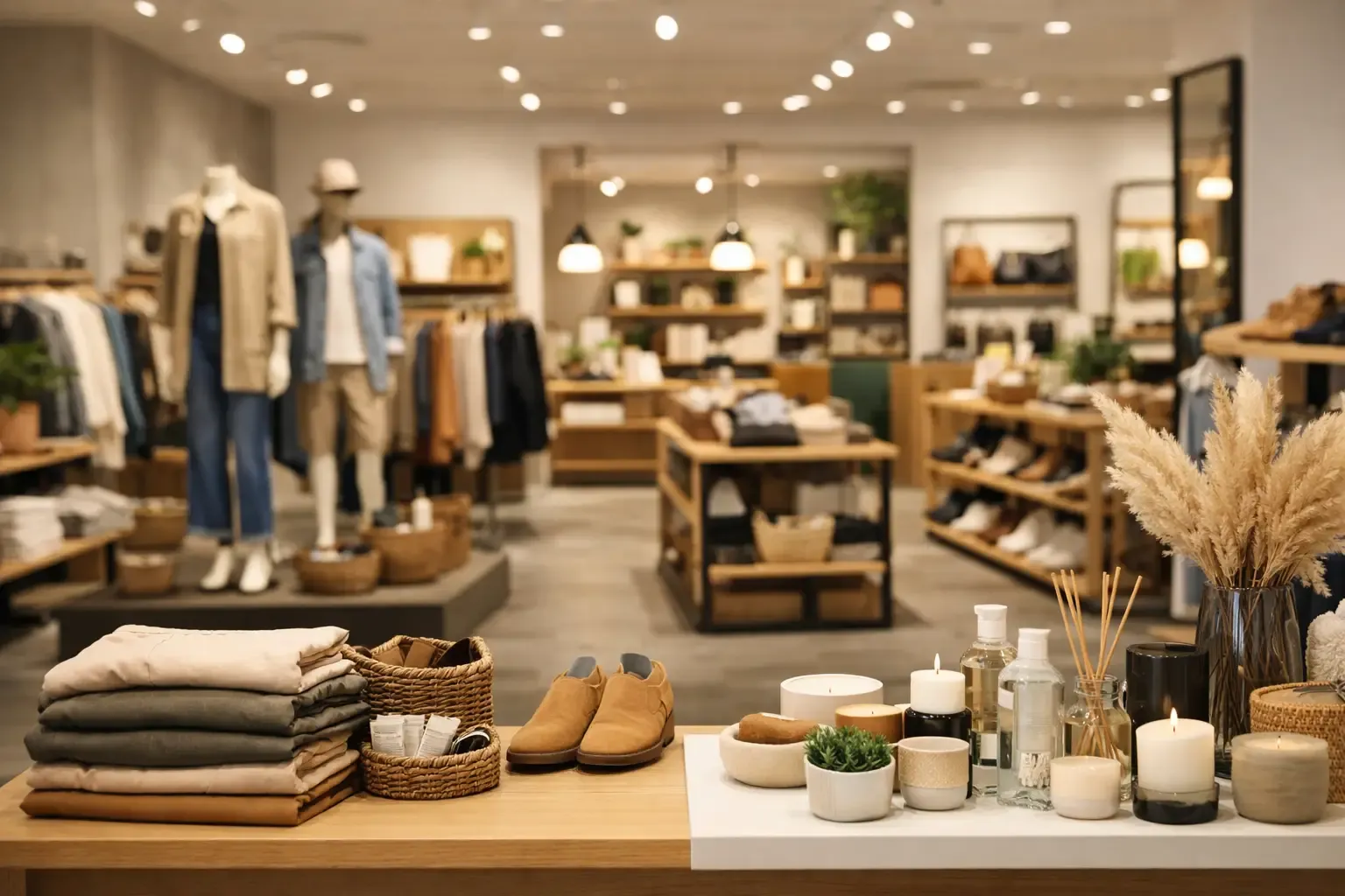
A retail layout is not decoration. It is an operating system for how customers move, what they notice, how associates work, and how much revenue each square foot produces. The best retail store layout ideas do more than make a space look polished. They remove buying friction, protect margin, and give your team a floor they can actually run during a rush.
A layout that photographs well but creates blind spots, blocked replenishment routes, or a checkout line through the selling floor is not a successful layout. It is an expensive operational problem. Start with the customer journey, then pressure-test every decision against staffing, inventory flow, security, accessibility, and transaction volume.
Best retail store layout ideas start with the operating model
Before selecting fixtures or drawing a floor plan, define what the store must accomplish. A specialty food shop with sampling, a boutique with high-touch appointments, and a convenience-led retail concept need different circulation patterns. Copying a large-format retailer's grid layout into a small premium store can make the space feel crowded and impersonal. Using a free-flow boutique layout in a high-volume grab-and-go operation can slow service and invite shrink.
Measure the realities that drive the plan: expected daily traffic, peak-hour transactions, average basket size, delivery frequency, number of employees on the floor, and the percentage of sales coming from impulse versus destination items. Layout decisions should follow those numbers.
1. Build a clear decompression zone
The first several feet inside the entrance are where customers adjust from the sidewalk, parking lot, or mall corridor to the store environment. Keep this area open. Avoid placing your highest-margin display directly in the doorway, where customers are still orienting themselves and are least likely to engage.
Use the decompression zone to establish sightlines. Customers should quickly understand where to go, what the store sells, and what feels worth exploring. A clean visual anchor farther inside the store works better than a crowded entrance table.
2. Create a natural path, not a forced maze
Most customers will move in the direction that feels obvious. In many US retail environments, that means they tend to turn right after entering, but the building, entrance orientation, and customer base can change that behavior. Observe your actual traffic before treating the right-hand wall as a rule.
Use flooring changes, lighting, fixture placement, and focal displays to guide movement through key categories. The goal is not to force every guest through every aisle. It is to expose them to relevant merchandise while keeping the trip easy. A path that feels manipulative drives quick exits, especially for repeat customers who know exactly what they need.
3. Put the destination category deep enough to earn the trip
A product customers specifically came to buy should not always sit at the front door. Placing destination merchandise farther into the store can increase exposure to complementary categories along the way. For a specialty beverage retailer, that may mean positioning the core wine selection behind glassware, snacks, gift items, and seasonal displays.
Do not take this too far. If a frequent, time-sensitive purchase requires customers to cross the entire floor every visit, you create frustration. The right location depends on purchase frequency and the store's service promise.
4. Use the power wall as a margin driver
The wall customers see first after they enter is premium real estate. Reserve it for seasonal stories, new arrivals, profitable private-label items, or a tightly edited collection that communicates your point of view. It should not become a dumping ground for excess inventory.
Refresh this wall on a disciplined cadence. Stale visual merchandising tells regulars there is nothing new to see. A weekly refresh may be appropriate for a fast-moving specialty market; a monthly change may be sufficient for a lower-traffic luxury concept.
5. Build category adjacencies around how customers buy
Merchandising should reflect the customer's use case, not just the vendor's product hierarchy. A home goods store can place cocktail napkins, bar tools, and glassware near one another. A specialty food retailer can combine pasta, sauces, oils, and entertaining pieces in a meal-focused zone.
The test is simple: does proximity make the basket more complete? Good adjacencies increase units per transaction without requiring an associate to explain every cross-sell. Poor adjacencies create visual noise and complicate replenishment.
6. Give impulse products a job to do
Impulse displays work when the item is affordable, easy to understand, and relevant to the shopping moment. They do not work because a basket was placed near the register. At checkout, limit the offer to a focused mix of add-ons, gifts, consumables, or last-minute problem solvers.
Keep the counter clear enough for payment, bagging, returns, and guest interaction. In high-volume stores, an overloaded cash wrap slows transactions and increases errors. Sales gained from one extra display are quickly lost if the line becomes the store's dominant experience.
7. Design the cash wrap for service, security, and recovery
The checkout area is a workstation, not merely a furniture piece. Associates need room for bags, receipt printers, supplies, returns, online-order pickups, and controlled access to high-risk merchandise. They also need sightlines across the floor.
Locate the cash wrap where staff can greet arrivals and monitor the sales floor without blocking traffic. If you operate with lean staffing, this matters even more. A beautiful counter in a back corner may leave too much of the store unobserved and make it difficult to respond when several customers need help at once.
8. Protect aisle width and accessibility from the start
Fixture density is one of the most common layout mistakes. Operators see open floor space and assume it should hold more product. But narrow aisles reduce comfort, create wheelchair-access issues, make strollers difficult to navigate, and prevent associates from replenishing without disrupting customers.
Plan for accessibility, turning space, and safe egress before the store is filled with merchandise. Local code requirements and lease conditions matter, but basic hospitality matters too. Customers should not have to apologize for taking up room in your store.
9. Create stopping points with purpose
Every store needs moments that slow customers down: a feature table, a demonstration area, a tasting station, or a well-lit new-arrivals fixture. These points should give customers a reason to pause, not simply interrupt circulation.
For food, beverage, and experiential retail, sampling can be a high-performing stop point when it is properly staffed and controlled. It can also become a labor-heavy distraction if it blocks the entrance, creates sanitation issues, or lacks a clear conversion plan. Track the sales lift before treating it as permanent programming.
10. Separate customer flow from back-of-house flow
Receiving, replenishment, trash, storage, and online fulfillment should not compete with the customer journey. When associates are pushing carts through prime selling areas during peak hours, the floor plan is working against both service and productivity.
Create practical routes from storage to major departments. Include staging space for deliveries and returns. If the footprint is tight, schedule replenishment around peak traffic instead of pretending the conflict does not exist.
11. Use vertical space without hiding the merchandise
Wall systems, shelving, and vertical displays can improve capacity, particularly in small stores. The trade-off is shoppability. Products placed too high are easy to stock but hard to sell, while tall fixtures can block sightlines and make a small store feel compressed.
Keep the strongest products within comfortable reach and use upper levels for display inventory, lighter goods, or clearly signed categories. Lighting is critical here. Dark upper shelves quietly turn inventory into dead stock.
12. Test the layout after opening
A floor plan is a working hypothesis. Once the store is open, watch where customers hesitate, where they turn around, what fixtures get ignored, and when queues form. Review transaction data by category and time of day. Ask associates which tasks create bottlenecks and which questions customers repeat.
Small changes often produce meaningful gains: moving a feature table six feet, widening a pinch point, shifting a destination item, or changing the order of a category wall. Step It Up Strategies approaches layouts this way - as a living operational tool tied to revenue, labor, and guest experience, not a one-time design exercise.
Make the floor plan accountable to performance
The strongest layouts make shopping feel natural while making operations more controlled. They help customers find what they want, expose them to what they did not know they wanted, and give employees a manageable environment for selling and recovery.
Do not judge the plan only by opening-day appearance. Judge it by conversion, average transaction value, sales per square foot, labor efficiency, shrink, and the quality of the customer interaction. When the layout supports those outcomes, the store is built to perform long after the fixtures stop looking new.